Primary, Secondary & Tertiary Colors
- Primary colors: Red, blue, and yellow—used as foundational tones in many art pieces.
- Secondary colors: Created by mixing primaries—green, orange, and purple.
- Tertiary colors: Subtle blends (like blue-green or red-orange) that create depth and mood.
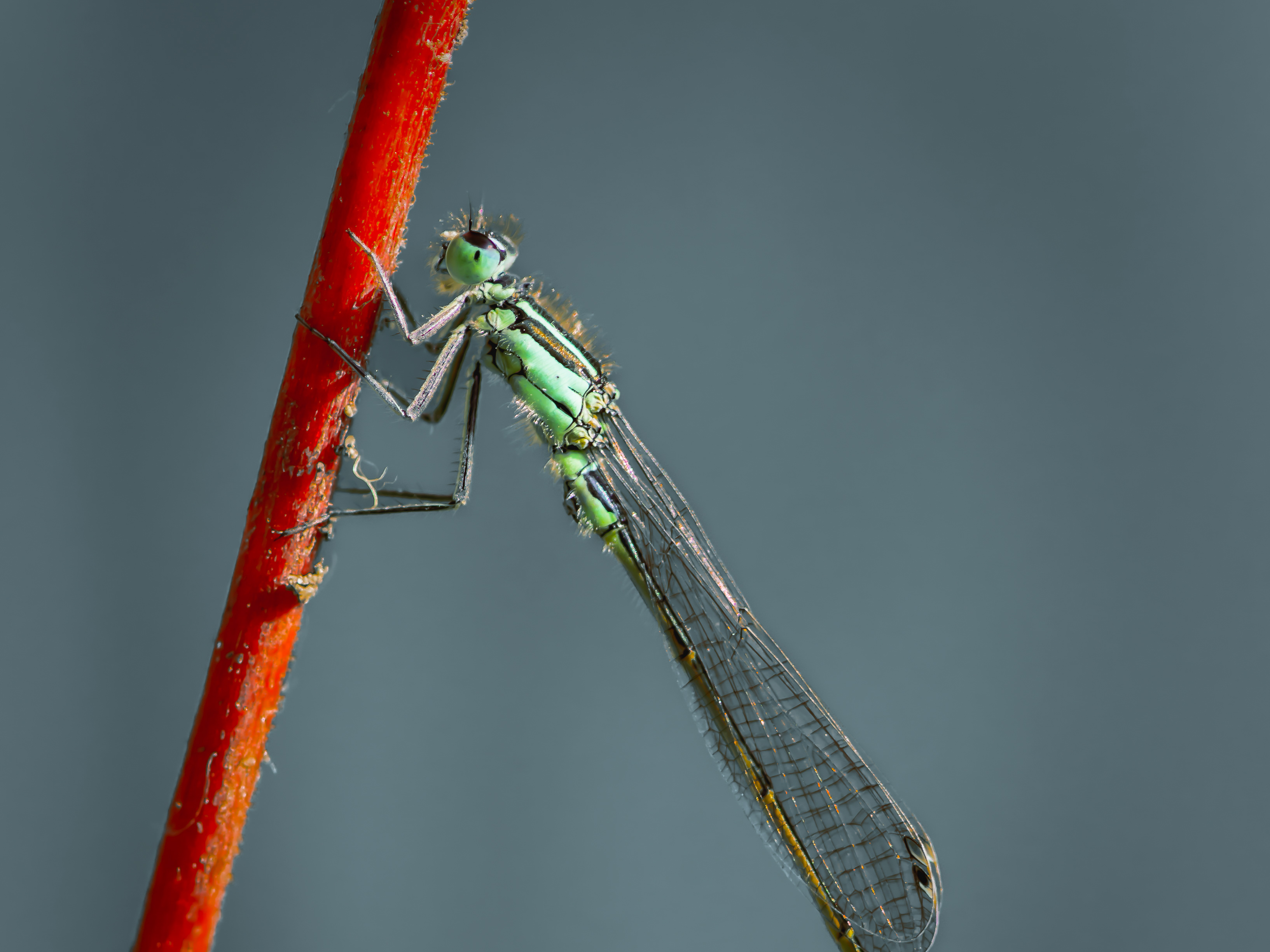
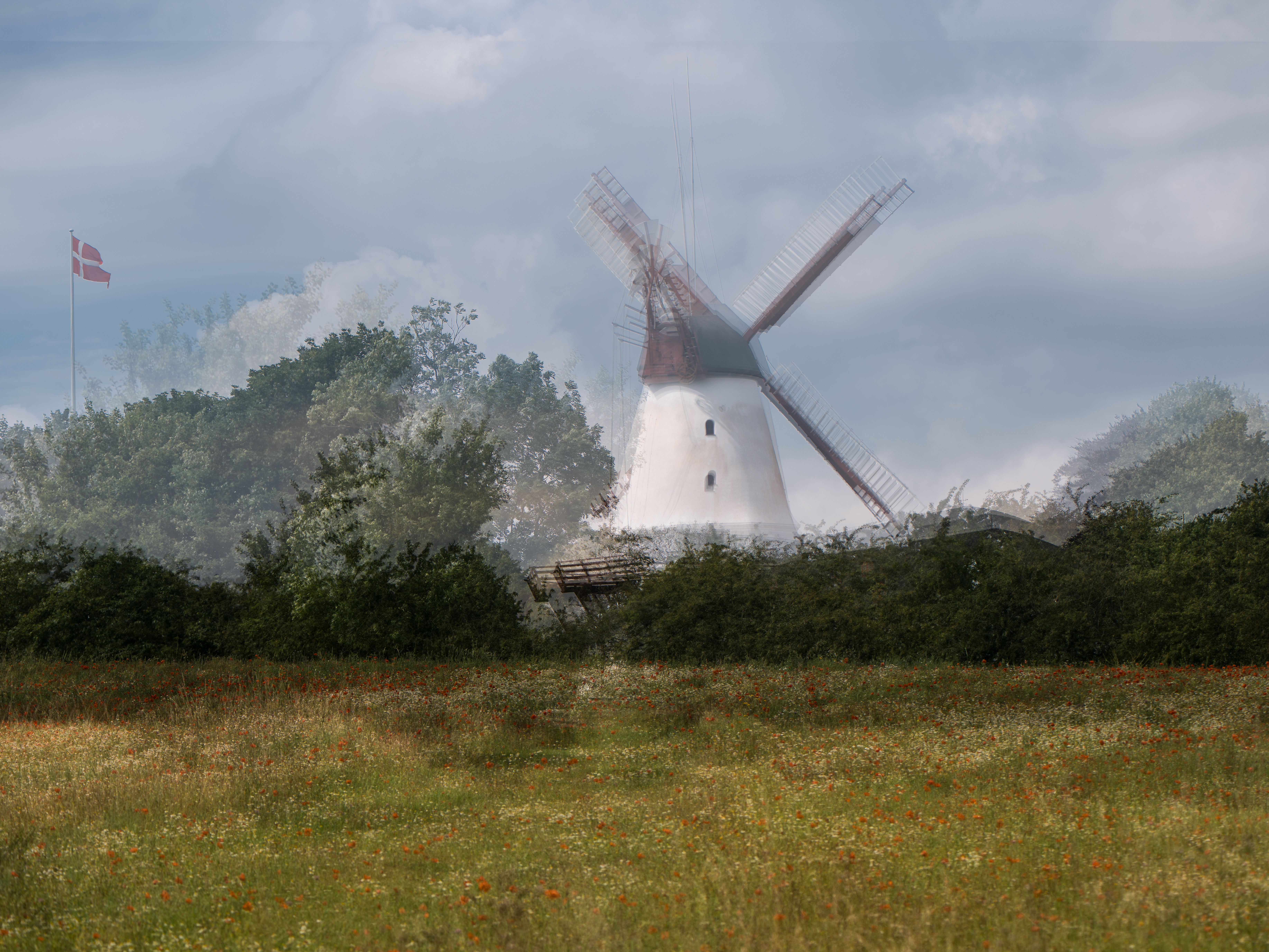
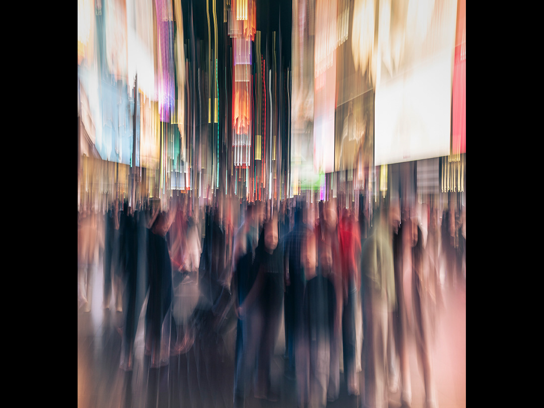
In abstract and expressive photography, these colors may blend or shift across exposures, creating layered color fields that are both organic and emotionally rich.
Color Harmony in Wall Art
Complementary colors (opposites on the color wheel, like blue and orange) create bold contrast and high energy. Perfect for making a statement in modern or industrial interiors.
Analogous colors (next to each other on the color wheel, like green–blue–teal) offer a softer, more cohesive look—ideal for calm, relaxing spaces like bedrooms or studios.
Monochromatic palettes (variations of a single hue) can create sophistication and unity, and often feel minimal or meditative.
Color Psychology: How Art Makes You Feel
Red and orange: Passion, energy, warmth
Blue and teal: Calm, trust, introspection
Green: Renewal, balance, nature
Yellow: Optimism, brightness, clarity
Purple: Creativity, mystery, luxury
Neutrals (white, gray, black): Simplicity, structure, depth
When browsing photographic prints, consider what emotions the dominant colors evoke. A piece with shifting blue tones might feel like a quiet memory; one with deep reds could feel alive and stirring.
Matching Art to Your Space
Warm-toned prints can energize cool, minimal interiors.
Cool-toned pieces can bring softness and calm to vibrant or cluttered spaces.
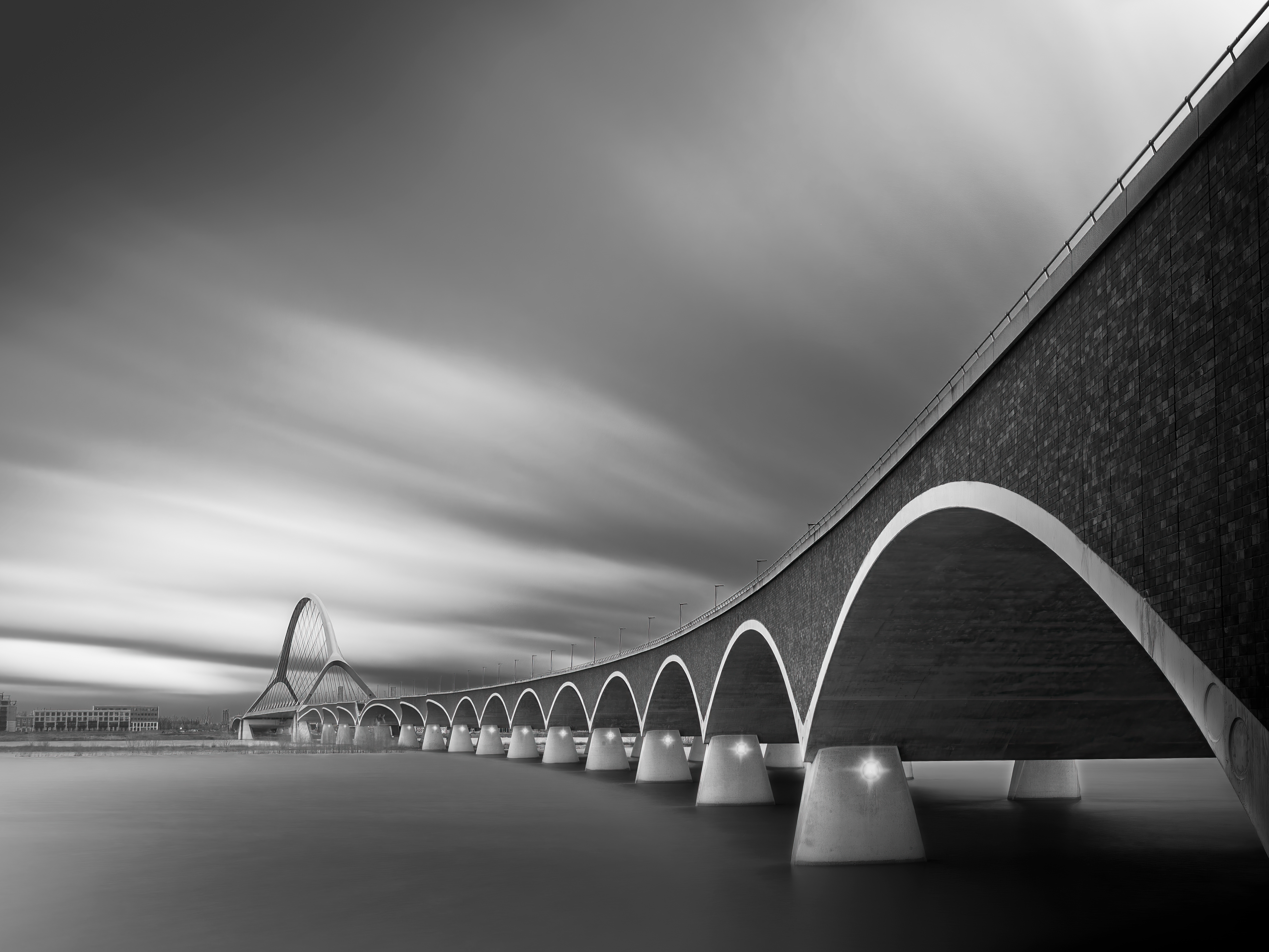
High-contrast works create drama in otherwise neutral rooms.
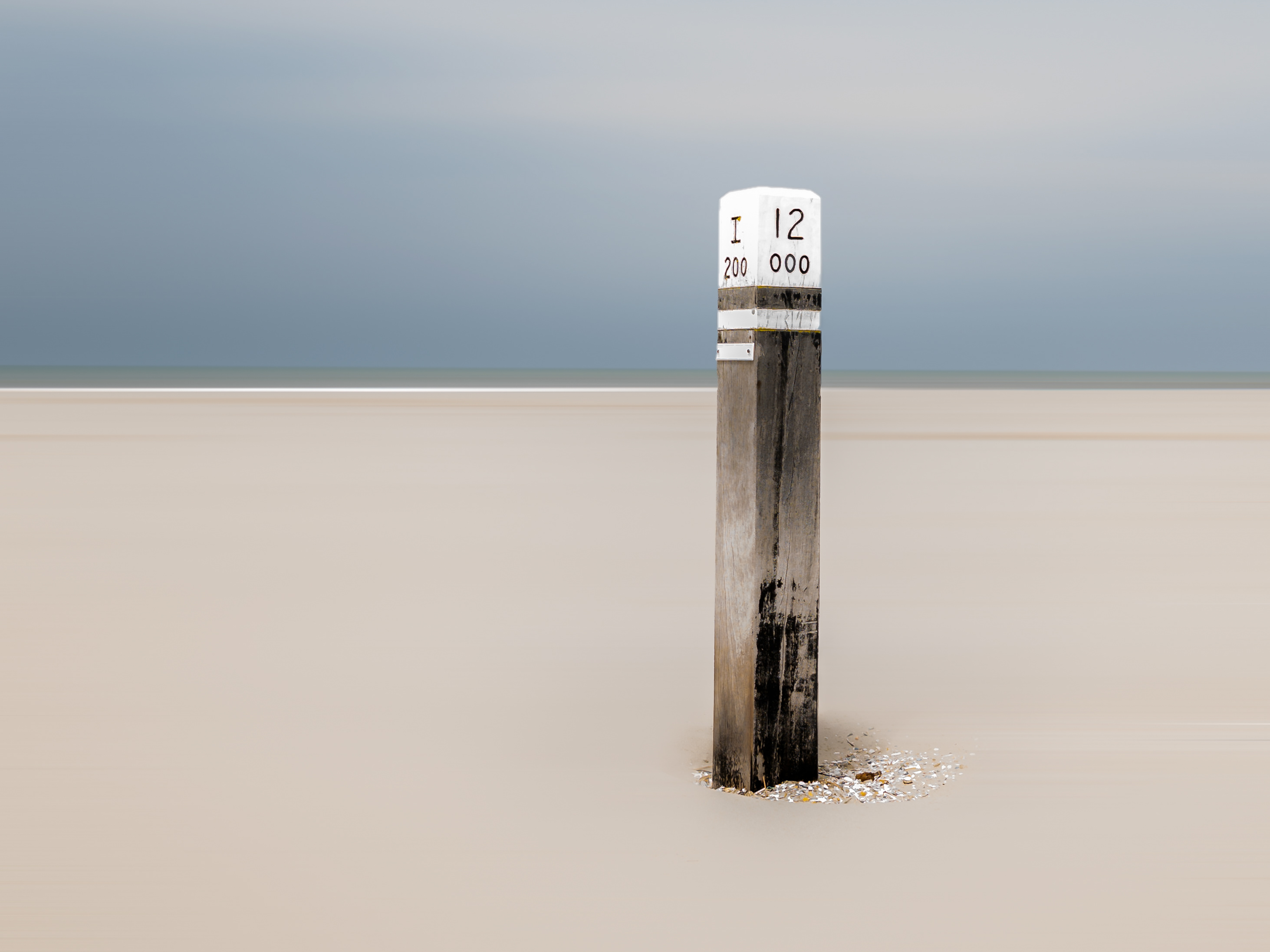
Desaturated or muted tones often feel timeless and versatile.
Try to balance the energy of the artwork with the mood of the room. Don’t just match colors—match feelings.
💡 Final Tip: Let the Art Speak First
Color theory is a powerful tool—but don’t overthink it. If you find yourself drawn to a piece emotionally, it’s probably the right one. Trust your instincts. Your connection to color is personal, and the most beautiful art is the kind that resonates with you.

